The Challenge
How do you make a rigorous, methodologically complex system feel accessible and manageable to the people who actually have to use it, without oversimplifying what makes it valuable in the first place?
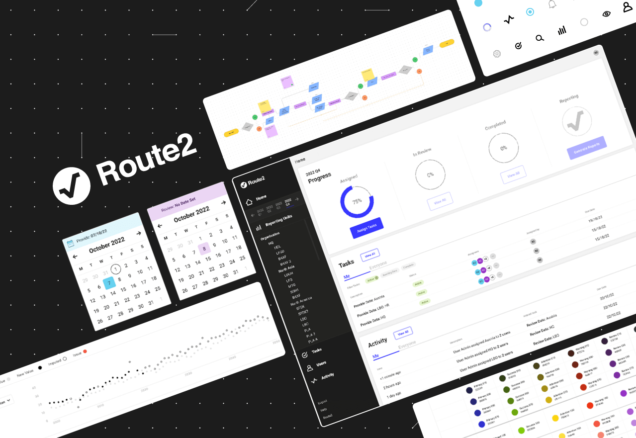
Route2 had been collecting sustainability data manually, through spreadsheets and individual consultant relationships. This process was resource intensive, and often led to colleagues and clients alike becoming overwhelmed.
Each client requires a different set of impact indicators (Diesel Use, Workplace Injuries), some core, others sector-specific, and in some cases entirely new indicators. Getting the right data from the right people, mapped accurately to the V2S™ calculation engine, using flexible mental models, was a significant design problem.
My Role
Responsibility for design decisions, from initial concept to production-ready components.
Three personas were defined, Internal Admin, Client Admin, and Data Provider, each built around a user story. Those stories became the basis for end-to-end user flows, identifying key interactions, decision points, and where roles intersected or conflicted.
The flows pointed toward the features the platform needed, prioritised with the CPO and engineering team before moving into wireframes. Low fidelity first, validated with the team, then high fidelity.
A design system grew alongside the product, from typography through to complex interactive elements, serving as the single source of truth throughout build.
Design Decision: Data Input
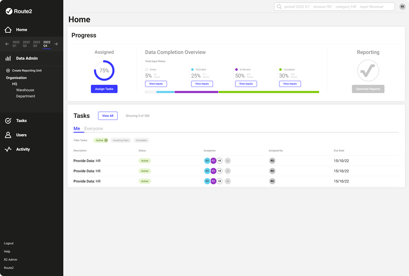
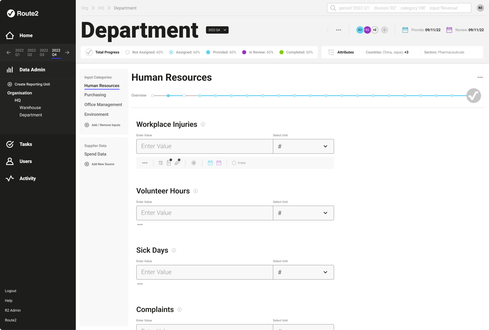
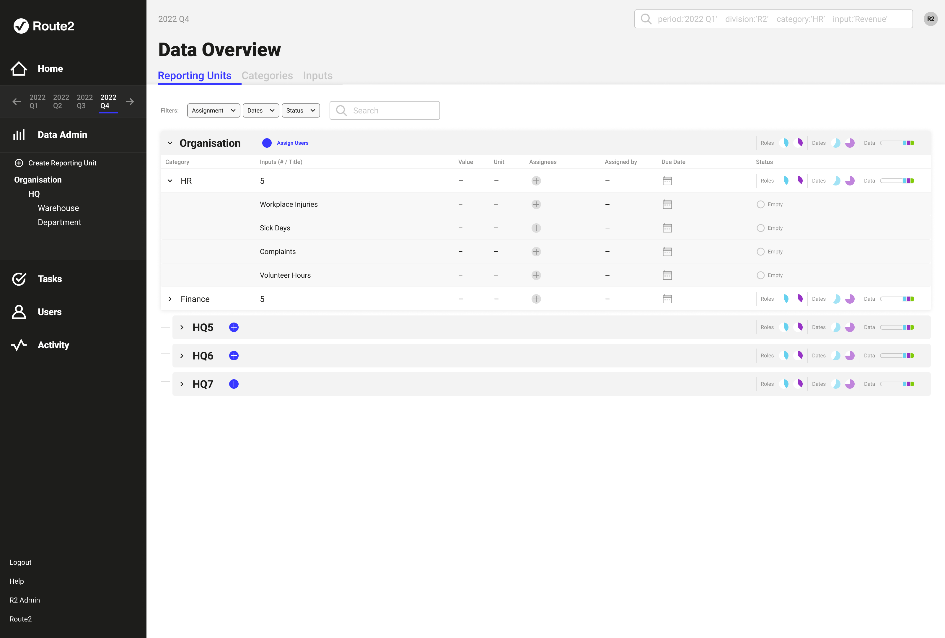
Clients had reported being overwhelmed by the volume of information in the spreadsheets. The decision was to move away from the spreadsheet model entirely and design around a single-input-at-a-time component, one indicator, clearly presented, with everything needed to complete it in one place.
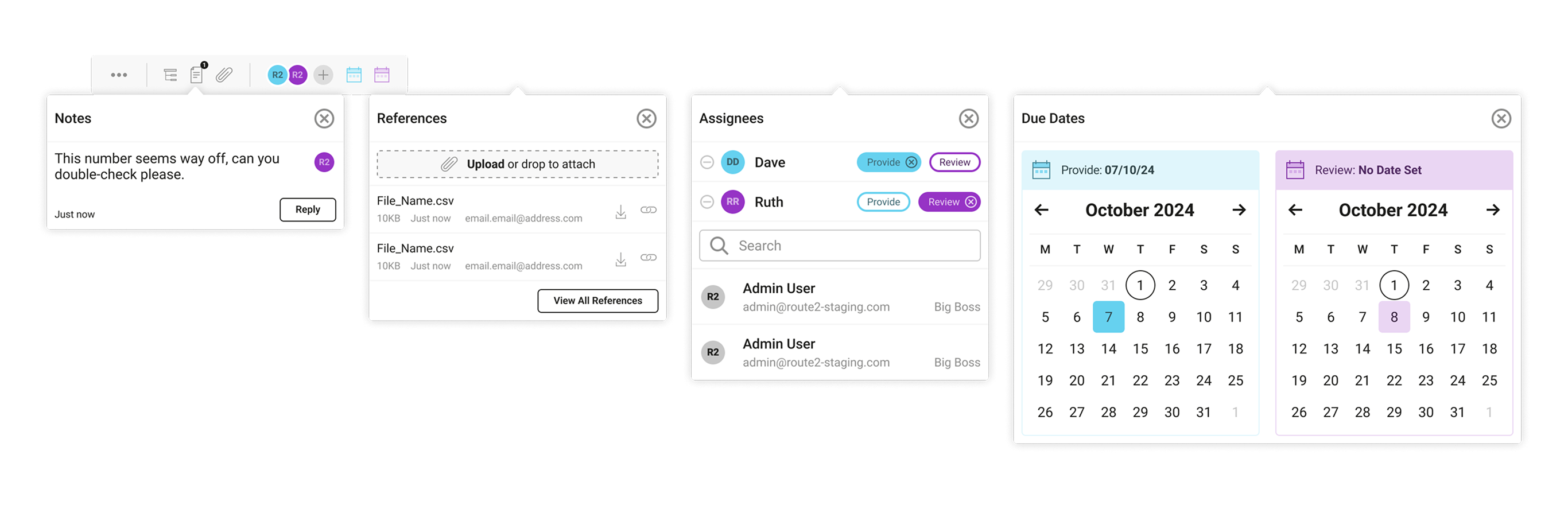
Each data object on the platform required multiple states to be tracked. These states needed to be easily visible and navigable for client admins and would be surfaced upward into progress overviews. Each state came with it’s own set of UI elements depending on the needs of the current user role.
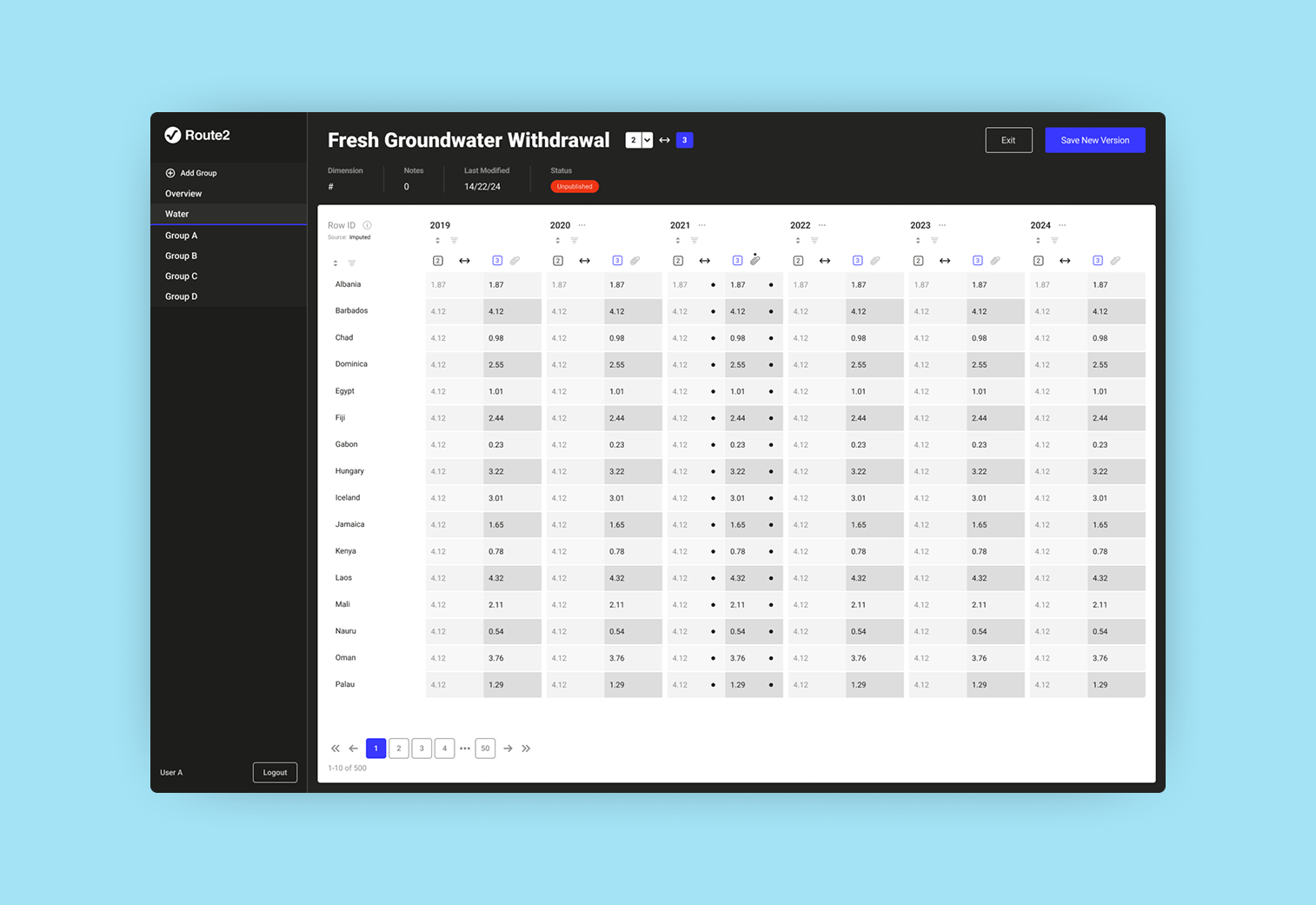
Granular V2S calculation outputs require granular inputs. Allowing users to provide data in as much detail as was available became a valuable asset to the platform. The solution was an attribute and tagging system which allowed for granular input whilst not overburdening the UI. A breakdown drawer attached to individual inputs allowed the users to add additional, and chain multiple, attributes and provide values for each combination.
Design Decision: The Assignment and Reporting Structure
Different organisations think about responsibility differently. The platform had to serve both without forcing either. In large organisations responsibility for collecting data is distributed across departments, reporting units, and geographies, and different organisations structure that responsibility differently. Some think in terms of regional divisions, others think functionally, an HR team owns HR data wherever it appears, regardless of reporting unit. A platform that only served one mental model would break down for the other. The MVP assignment model followed a rigid organisational structure. Maintaining a consultant led approach allowed this to be minimally taxing for clients, and also provided insight into further changes required. Assigning a user to a reporting unit implicitly assigned them to everything beneath it, cascading downward through however many levels the tree contained. This worked well structurally. It broke down when a client needed to assign their HR team to every instance of the HR category across all reporting units simultaneously, in the structural view, the only way to do this was unit by unit.
The solution was a shift in information architecture, offering alternative views of the same underlying data. 1) Reporting Units. The familiar structural hierarchy. 2) Categories. Category as the primary item, expandable to reveal every instance, assignable at category level in a single action. 3) Inputs. Full granularity for edge cases. The data hadn’t changed. The hierarchy hadn’t changed. What changed was the axis, aligning the views to the mental model of the person using them, rather than the architecture of the data beneath them.